
Concept · Brand identity
Identity system
An exploration of a brand identity built as a system — positioning, typography, colour and application working as one.
PositioningVisual identityTypographyGuidelines
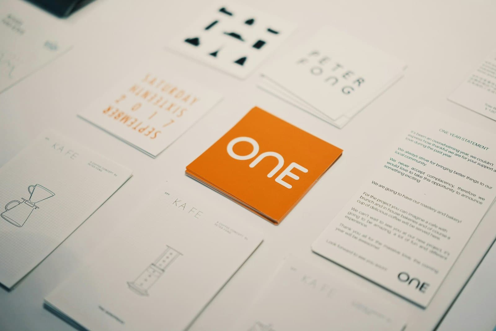
Concept exploration created by Teqzero to illustrate our approach — not a client project.
Overview
- Type
- Concept
- Category
- Brand identity
A concept showing how we build identities as systems rather than logos — so the brand stays recognisable as the business grows into new products and channels.
Objectives
- Define a clear position
- Create a distinctive, flexible visual language
- Document it so anyone can apply it
Our approach
How we think about it
/01
Position first
Who are you, who are you for, and why should they choose you?
/02
System design
Logo, type, colour, grid and imagery designed together.
/03
Application
Digital, packaging and campaigns tested against the system.
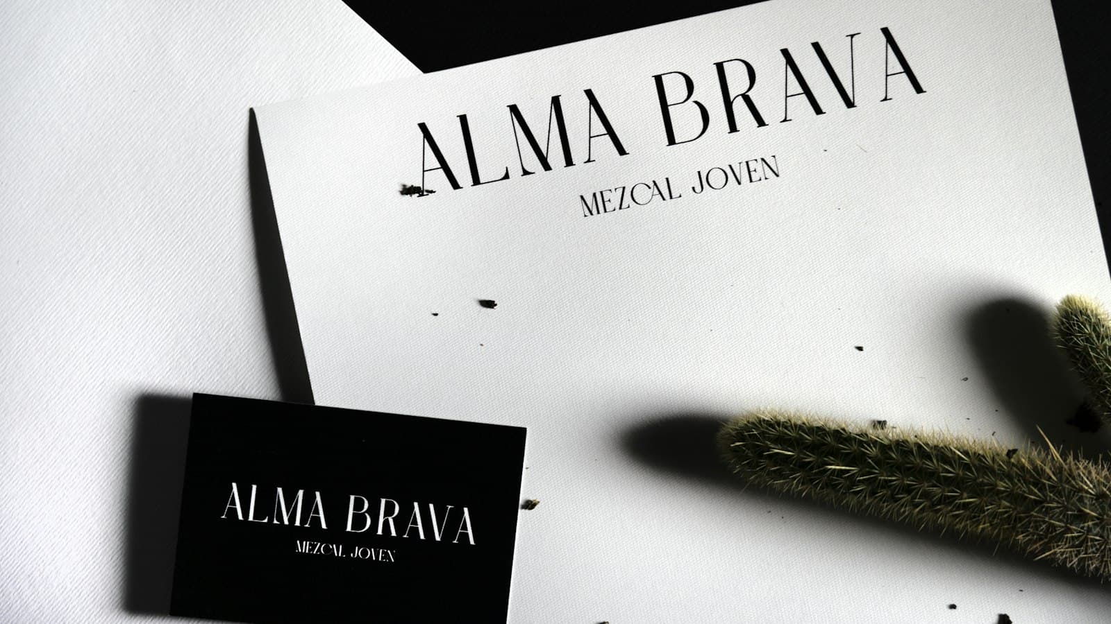
Design & development highlights
Typography
A type system with clear hierarchy.
Colour
A restrained palette with a signature accent.
Guidelines
Rules that keep every application consistent.
Concept only — not a client project. Shown to illustrate our branding approach.
More work
Keep exploring


Let’s build what’s next
The best work starts with a better question.
What are you trying to build?